How to create a Liquid Glass effect with SVG filters
In June 2025 Apple revealed its new visual language, along with the beta launch of iOS 26. Liquid Glass was the name given to their “new and expressive material”, bending light, and distorting UIs. It received a mixed response, and just weeks after its launch we’ve seen Apple dial down their glassy effects to some degree.


We’ve covered CSS glass effects on Tuts+ before, but today we’re going to do things a little differently. Let’s dive into SVG filters!
What is an SVG filter?
CSS provides us with the filter property that allows us to apply visual effects such as blur, brightness, contrast, saturation, and other effects to HTML elements.
However, for more advanced, almost cinematic effects, SVG filters are a better choice. Unlike CSS filters, SVG filters are composed of modular building blocks known as primitives. When these primitives are combined, they produce powerful visual effects which would not be possible with CSS alone.
Some of the effects that can be applied using filters include custom blurs, water or ripple effects, realistic drop shadows, lighting effects, etc.
SVG filters are created using the
Just like any other SVG element, the
1 |
|
2 |
|
3 |
|
id: used to identify the filter.x,yare the positions of the filter relative to the target element.widthandheight: specify the size to be covered by the filter.filterUnitsis the coordinate system for x, y, width, and height.primitiveUnitsdefines the coordinate system inside the filter primitives
Inside the
In this tutorial, we’ll only focus on the
For example, to blur an element, we use the
1 |
|
The in attribute defines the input source of the filter primitive while the stDeviation determines the strength of the blur. Once we define the SVG filter, we’ll apply it to an HTML element or another SVG by referencing its id using the filter property.
In action
So for example, suppose we have a green SVG circle that looks like this:
1 |
|
2 |
|
3 |
|
If we needed to apply a blur to the SVG circle, we would create a filter containing a
1 |
|
2 |
|
3 |
|
4 |
|
5 |
|
6 |
|
SVG primitives typically have both an input(in) as well as an output(result). The output of one primitive is used as input of another primitive hence creating a chain of primitives for more advanced effects.
In this code snippet, in=sourceGraphic means that the blur will be applied to the original graphic, in this case, the green circle, while the stdDeviation attribute controls the strength of the blur. The higher the value, the more intense and spread out the blur effect becomes.
feImage Filter Element
The
The output is then used by other primitives like the
For example, to load an image URL into the
1 |
|
2 |
href="https://example.com/image.png" |
3 |
x="0" y="0" |
4 |
width="100%" height="100%" |
5 |
result="map" /> |
feDisplacementMap Filter Element
The
1 |
|
2 |
id="disp" |
3 |
in="blur" |
4 |
in2="map" |
5 |
scale="0.8" |
6 |
xChannelSelector="R" |
7 |
yChannelSelector="G" |
8 |
>
|
For example, in the code above, the
-
in="blur"is the output of the Gaussian blur -
in2="map"is the displacement map image
The xChannelSelector attribute specifies which color channel from the displacement image is used to displace pixels along the x-axis while the yChannelSelector attribute specifies which color channel from the displacement image is used to displace pixels along the y-axis.
These channels can either be R(Red), G(Green) B(Blue) and A(Alpha). The scale attributes determine the intensity of the distortion effect.
Now that we know how SVG filters work and how to create them, we can create a liquid glass distortion effect and apply it to an HTML element.
Create a Liquid Glass button with SVG filters
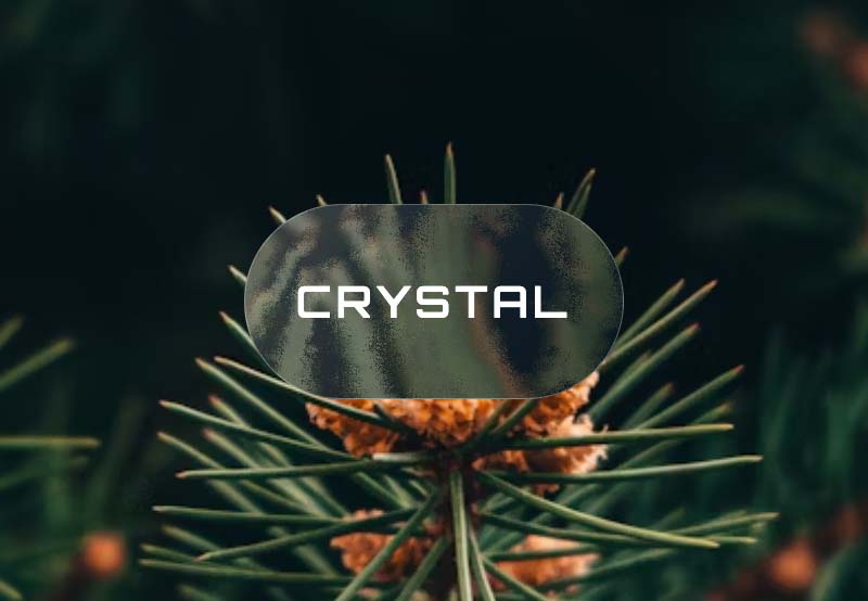
We’ll start with the HTML markup, a simple button and a span element.
1 |
|
2 |
CRYSTAL
|
3 |
|
Styling with CSS
To create a realistic glass button, we need three key ingredients:
- A background blur to blur whatever is behind the button and create a translucent frosted look. We will achieve this using the
feGaussianfilter. - A background image will enhance the realism of the blur.
- Transparency; we need to make the button partially see-through. Without the semi-transparent background, the button would be solid, hence hiding the blur effect.
Let’s add a background image to the page.
1 |
body { |
2 |
height: 150vh; |
3 |
background: url("https://images.unsplash.com/photo-1683657535824-5b570c7a1749?q=80&w=764&auto=format&fit=crop&ixlib=rb-4.1.0&ixid=M3wxMjA3fDB8MHxwaG90by1wYWdlfHx8fGVufDB8fHx8fA%3D%3D"); |
4 |
background-size: cover; |
5 |
}
|
We’ll also add a simple keyframe animation that will change the background’s position over time, hence creating a smooth floating animation.
1 |
body { |
2 |
height: 150vh; |
3 |
background: url("https://images.unsplash.com/photo-1683657535824-5b570c7a1749?q=80&w=764&auto=format&fit=crop&ixlib=rb-4.1.0&ixid=M3wxMjA3fDB8MHxwaG90by1wYWdlfHx8fGVufDB8fHx8fA%3D%3D"); |
4 |
background-size: cover; |
5 |
animation: floatBG 15s ease-in-out infinite; |
6 |
}
|
7 |
|
8 |
@keyframes floatBG { |
9 |
0%, |
10 |
100% { |
11 |
background-position: center center; |
12 |
}
|
13 |
25% { |
14 |
background-position: 30% 70%; |
15 |
}
|
16 |
50% { |
17 |
background-position: 70% 30%; |
18 |
}
|
19 |
75% { |
20 |
background-position: 40% 60%; |
21 |
}
|
22 |
}
|
Add these styles to the button.
1 |
.glass-button { |
2 |
position: fixed; |
3 |
top: 50%; |
4 |
left: 50%; |
5 |
transform: translate(-50%, -50%); |
6 |
cursor: pointer; |
7 |
outline: none; |
8 |
width: 350px; |
9 |
height: 180px; |
10 |
border-radius: 999px; |
11 |
|
12 |
}
|
13 |
|
14 |
.glass-button span { |
15 |
font-family: "Orbitron", sans-serif; |
16 |
color: white; |
17 |
font-size: 2.5rem; |
18 |
font-weight: 600; |
19 |
text-transform: uppercase; |
20 |
letter-spacing: 0.1em; |
21 |
|
22 |
}
|
We have positioned the button at the center using fixed:position so it stays in place when the background animates. This will ensure the glass effect is visually enhanced.
By default, the button has a solid background, we’ll replace it with a transparent gradient and a semi-transparent border to also enhance the glass illusion.
1 |
.glass-button { |
2 |
position: fixed; |
3 |
top: 50%; |
4 |
left: 50%; |
5 |
transform: translate(-50%, -50%); |
6 |
cursor: pointer; |
7 |
outline: none; |
8 |
width: 350px; |
9 |
height: 180px; |
10 |
border-radius: 999px; |
11 |
border: 1px solid rgba(255, 255, 255, 0.3); |
12 |
background: linear-gradient( |
13 |
135deg, |
14 |
rgba(255, 255, 255, 0.2) 0%, |
15 |
rgba(255, 255, 255, 0.08) 50%, |
16 |
rgba(255, 255, 255, 0.03) 100% |
17 |
);
|
18 |
}
|
So far, the button looks like this:


We need to make it more glassy by adding SVG filters.
Glass distortion
To create the glass distortion effect with SVGs, we’ll use a combination of blur, displacement, and a texture map. Let’s start by defining the
1 |
|
2 |
|
3 |
|
4 |
|
Next, we’ll add a Gaussian blur to the source graphic using the
1 |
|
A good displacement map image should have high contrast and noticeable color variations. This is important because the distortion depends on the intensity of the color channels.
To ensure the displacement image covers the whole filter area, we have defined x,y, width, and height. Depending on the size of the element the filter will be applied to, you will need to adjust these values to achieve the desired result.
1 |
|
As you can see in the href directly because the base64-encoded version of the image would be very long. Instead, we’ll use JavaScript to set the href dynamically.
Add this code in your JavaScript file
1 |
const feImage = document.querySelector('feImage'); |
2 |
fetch('https://essykings.github.io/JavaScript/map.png') |
3 |
.then((response) => { |
4 |
return response.blob(); |
5 |
})
|
6 |
.then((blob) => { |
7 |
const objURL = URL.createObjectURL(blob); |
8 |
|
9 |
feImage.setAttribute('href', objURL); |
10 |
});
|
Here, we first select the querySelector, then we fetch the image from a hosted URL, convert the response into a Blob (a binary representation of the image), and then assign the objectURL as the href value of the
We now have the blurred content and the image map, so let’s combine them using the
1 |
|
Now, the final SVG filter looks like this:
1 |
|
2 |
|
3 |
|
4 |
|
5 |
|
6 |
|
7 |
|
Apply the SVG glass distortion effect on the button using the backdrop-filter property.
1 |
backdrop-filter: url(#glass); |
Finally, to enhance the interactivity of the glass button, let’s add a zoom effect on hover.
1 |
.glass-button:hover { |
2 |
transform: translate(-50%, -50%) scale(1.05); |
3 |
}
|
Final result
Here is the final result of the glass button in action:
Conclusion
We have seen how powerful SVG filters can be, with just a few SVG filter primitives, we have created a realistic glass distortion effect, similar to Apple’s Liquid Glass effect. Now you can use SVG filters to create visual styles directly in your browser.