Build your own Typographic Scale tool with JavaScript
The tool will have the following features:
- Ability to select a font base size
- Ability to choose different fonts from commonly used Google Fonts
- Ability to adjust the font weight
- A live preview for visualizing the typography scaling
- Ability to generate and copy CSS variables.
So.. what exactly are we building?
Here’s a demo to show what we’re working towards:
Setting up the HTML Structure
Let’s start by setting up the structure in HTML.
1 |
|
2 |
|
3 |
|
4 |
Create a harmonious type scale for your website |
5 |
|
6 |
|
7 |
|
8 |
|
9 |
|
10 |
type="number" |
11 |
id="base-size" |
12 |
value="16" |
13 |
min="8" |
14 |
max="32" |
15 |
step="1" |
16 |
/>
|
17 |
|
18 |
|
19 |
|
20 |
|
21 |
|
22 |
|
23 |
|
24 |
|
25 |
|
26 |
|
27 |
|
28 |
|
29 |
|
30 |
|
31 |
|
32 |
|
33 |
|
34 |
|
35 |
|
36 |
|
37 |
|
38 |
|
39 |
|
40 |
|
41 |
|
42 |
|
43 |
|
44 |
|
45 |
|
46 |
|
47 |
|
48 |
class="css-output" |
49 |
type="text" |
50 |
id="css-output" |
51 |
style="display: none" |
52 |
/>
|
53 |
|
54 |
|
55 |
|
56 |
Preview
|
57 |
|
58 |
|
59 |
|
60 |
|
61 |
|
From the HTML structure, you can see we have several select inputs for choosing options such as font family, font weight, and the scale ratio.
We also have a preview container to display the generated type scale in real-time and a button for copying the generated CSS variables.
Our type scale tool consists of 2 sections: the upper section containing the controls, and the bottom section which has the preview container.
Let’s add some basic styling for the body, header, and container.
1 |
body { |
2 |
font-family: "inter", sans-serif; |
3 |
background-color: #f8fafc; |
4 |
color: #1e293b; |
5 |
line-height: 1.65; |
6 |
}
|
7 |
|
8 |
.container { |
9 |
max-width: 1200px; |
10 |
display: flex; |
11 |
flex-direction: column; |
12 |
background-color: white; |
13 |
margin: 40px auto; |
14 |
border-radius: 12px; |
15 |
box-shadow: 0 2px 4px rgba(0, 0, 0, 0.1); |
16 |
}
|
17 |
header { |
18 |
width: 100%; |
19 |
padding: 16px; |
20 |
text-align: center; |
21 |
}
|
22 |
|
23 |
h1 { |
24 |
font-size: 2rem; |
25 |
font-weight: 700; |
26 |
margin-bottom: 8px; |
27 |
}
|
28 |
header p { |
29 |
font-size: 1rem; |
30 |
}
|
31 |
|
32 |
|
To ensure the inputs are responsive, add flex:wrap to the controls section.
1 |
.controls { |
2 |
display: flex; |
3 |
flex-wrap: wrap; |
4 |
gap: 40px; |
5 |
padding: 32px; |
6 |
border-bottom: 1px solid #e5e7eb; |
7 |
}
|
Next, style the input and select elements.
1 |
input, |
2 |
select { |
3 |
width: 100%; |
4 |
padding: 8px; |
5 |
border: 1px solid #e5e7eb; |
6 |
border-radius: 6px; |
7 |
font-size: 0.75rem; |
8 |
font-family: "Inter", sans-serif; |
9 |
color: #1e293b; |
10 |
}
|
11 |
|
12 |
input:focus, |
13 |
select:focus { |
14 |
outline: none; |
15 |
border-color: #8a8a9081; |
16 |
}
|
Apply the following styles to the preview container to ensure it’s scrollable on small screens.
1 |
.preview-container { |
2 |
overflow-x: auto; |
3 |
white-space: nowrap; |
4 |
display: flex; |
5 |
flex-direction: column; |
6 |
background-color: white; |
7 |
border-radius: 6px; |
8 |
padding: 0 24px; |
9 |
box-shadow: 0 2px 8px rgba(0, 0, 0, 0.1); |
10 |
}
|
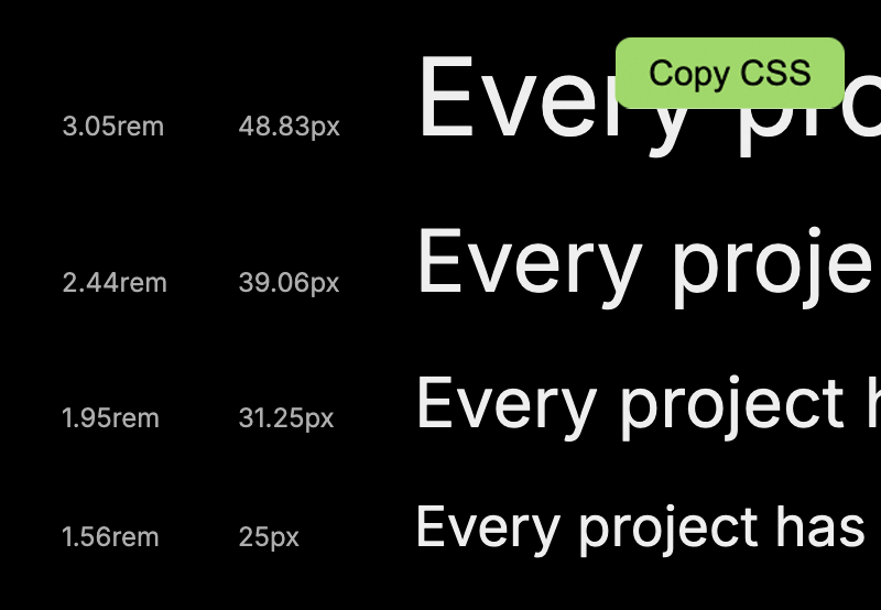
From the final result, you can see we have labels in px and rem, as well as a paragraph for displaying each font level. All these elements will be contained within a div with the class scale-item.
Style the item as follows:
1 |
.scale-item { |
2 |
display: flex; |
3 |
align-items: baseline; |
4 |
margin-bottom: 24px; |
5 |
}
|
6 |
|
7 |
.scale-item p { |
8 |
margin: 0; |
9 |
}
|
10 |
|
11 |
.scale-label { |
12 |
width: 80px; |
13 |
font-size: 0.75rem; |
14 |
color: #64748b; |
15 |
flex-shrink: 0; |
16 |
}
|
Finally, the Copy CSS button will have the following styles.
1 |
.copy-css { |
2 |
position: absolute; |
3 |
top: 20px; |
4 |
right: 20px; |
5 |
background-color: #e9ecef; |
6 |
padding: 6px 12px; |
7 |
border-radius: 6px; |
8 |
border: none; |
9 |
cursor: pointer; |
10 |
font-size: 0.8rem; |
11 |
}
|
12 |
|
13 |
.copy-css:hover { |
14 |
background-color: #dcdcdc; |
15 |
}
|
16 |
.css-output { |
17 |
opacity: 0; |
18 |
}
|
Generating Typographic Scales with JavaScript
We’ll start by getting the input and select elements.
1 |
const baseSize = document.getElementById("base-size"); |
2 |
const fontFamily = document.getElementById("font-family"); |
3 |
const fontWeight = document.getElementById("font-weight"); |
4 |
const scaleRatio = document.getElementById("scale-ratio"); |
We’ll also get the preview container and the Copy CSS button:
1 |
const preview = document.getElementById("preview"); |
2 |
const copyCSS = document.getElementById("copy-css"); |
Create an array of the most popular fonts and set them as options in the font family select input. Add the array as shown below.
1 |
const googleFonts = [ |
2 |
"Inter", |
3 |
"Roboto", |
4 |
"Open Sans", |
5 |
"Lato", |
6 |
"Montserrat", |
7 |
"Poppins", |
8 |
"Source Sans Pro", |
9 |
"Raleway", |
10 |
"Playfair Display", |
11 |
"Merriweather", |
12 |
"Ubuntu", |
13 |
"Nunito", |
14 |
"DM Sans", |
15 |
"Work Sans", |
16 |
"Titillium Web", |
17 |
"Fira Sans", |
18 |
"Rubik", |
19 |
"Lora", |
20 |
"Barlow", |
21 |
"Hind", |
22 |
"Cabin", |
23 |
"IBM Plex Sans", |
24 |
"Quicksand", |
25 |
"Karla", |
26 |
"PT Sans", |
27 |
"Heebo", |
28 |
"Mulish", |
29 |
"Overpass", |
30 |
"Jost", |
31 |
"Manrope", |
32 |
"Spectral", |
33 |
"Space Grotesk", |
34 |
"DM Mono", |
35 |
"Courier Prime", |
36 |
"Inconsolata", |
37 |
];
|
Let’s populate the font family select input with our fonts array.
1 |
function populateFonts() { |
2 |
googleFonts.forEach((font) => { |
3 |
const option = document.createElement("option"); |
4 |
option.value = font; |
5 |
option.textContent = font; |
6 |
fontFamily.appendChild(option); |
7 |
});
|
8 |
}
|
9 |
|
10 |
populateFonts(); |
Here we are looping through the fonts array, creating an option elements for each font and setting its value and text content to the font name. Finally the option element is added to the font family select element.
Set the first font in the array as the default on the input.
1 |
applyFont(googleFonts[0]); |
To ensure the correct font and all its weights are loaded directly from Google Fonts, create a function called applyFont() and add the currently selected font as a stylesheet link in the page header.
1 |
function applyFont(font) { |
2 |
const existingLink = document.querySelector( |
3 |
"link[href*='fonts.googleapis.com']" |
4 |
);
|
5 |
if (existingLink) { |
6 |
existingLink.remove(); |
7 |
}
|
8 |
const link = document.createElement("link"); |
9 |
link.href = `https://fonts.googleapis.com/css2?family=${font}:wght@100;200;300;400;500;600;700;800;900&display=swap`; |
10 |
|
11 |
link.rel = "stylesheet"; |
12 |
document.head.appendChild(link); |
13 |
}
|
Levels in typographic scales
In typographic scale systems, levels are used to define the different steps or sizes within the scale. Each level corresponds to a specific role in web design.
For example:
- Higher levels are used for headings, for example,
h1andh2and so on - The base level is mostly used for the body
- Lower levels are mostly used for captions, foot notes, etc.
Each higher level is calculated by multiplying the base size by the scale ratio.
A scale ratio determines how each level increases relative to the base. Common scale ratios include:
- 1.25 (Minor Third)
- 1.33 (Perfect Fourth)
- 1.414 (Augmented Fourth)
- 1.5 (Perfect Fifth)
- 1.618 (Golden Ratio)
For example, suppose you want to use a scale ratio of 1.25 and your base font is 16px:
- Level 1 will be 16px * 1.25 = 20px
- Level 2 will be 20px * 1.25 = 25px and so on.
For levels below the base, we use negative level numbers (i.e. Level -1, Level -2, etc. ) .These are calculated by dividing the base size by the scale ratio.
For example, keeping your base size at 16px, if you want 2 levels below the base, it will look like this:
- Level-1 = 16px / 1.25 = 12.8px
- Level-2 = 12.8 /1.25 = 10.24px
The levels array
Now that we have understood how to use levels and scale ratios to generate fonts, let’s define our levels array.
1 |
const FONT_SIZES = [ |
2 |
{ name: "h1", level: 5 }, |
3 |
{ name: "h2", level: 4 }, |
4 |
{ name: "h3", level: 3 }, |
5 |
{ name: "h4", level: 2 }, |
6 |
{ name: "h5", level: 1 }, |
7 |
{ name: "body", level: 0 }, |
8 |
{ name: "small", level: -1 }, |
9 |
];
|
Create a function called calculateSize() which will calculate the font size based on the base size, the selected scale ratio, and the expected level.
Here is the formula:
1 |
size = baseSize * (scaleRatio ^ level) |
where :
-
baseSizeis the starting font size -
scaleRatiois the multiplier scale -
levelrepresents the step in the scale
The function will look like this:
1 |
function calculateSize(baseSize, level) { |
2 |
return parseFloat( |
3 |
(baseSize * Math.pow(scaleRatio.value, level)).toFixed(2) |
4 |
);
|
5 |
}
|
Then, create another function which will return font sizes in rems :
1 |
function calculateSizeInRem(baseSize, level) { |
2 |
return (calculateSize(baseSize, level) / 16).toFixed(2) + "rem"; |
3 |
}
|
Now we need to update the preview section with sample text showing how each level looks.
Updating the Preview pane
For each sample text, we will do the following:
- Display the font size both in px and rem
- Show a sample text that uses the currently selected size, font family, and font weight.
Here is the function that does that.
1 |
function updatePreview() { |
2 |
preview.innerHTML = ""; |
3 |
const base = parseFloat(baseSize.value); |
4 |
const font = fontFamily.value; |
5 |
|
6 |
const weight = fontWeight.value; |
7 |
|
8 |
FONT_SIZES.forEach(({ name, level }) => { |
9 |
const size = calculateSize(base, level); |
10 |
const remSize = calculateSizeInRem(base, level); |
11 |
const item = document.createElement("div"); |
12 |
item.classList.add("scale-item"); |
13 |
|
14 |
const pxLabel = document.createElement("div"); |
15 |
const remLabel = document.createElement("div"); |
16 |
remLabel.textContent = `${remSize}`; |
17 |
|
18 |
pxLabel.textContent = `${size}px`; |
19 |
pxLabel.classList.add("scale-label"); |
20 |
remLabel.classList.add("scale-label"); |
21 |
|
22 |
const text = document.createElement("p"); |
23 |
|
24 |
text.style.fontSize = `${size}px`; |
25 |
text.style.fontFamily = font + ", sans-serif"; |
26 |
text.style.fontWeight = weight; |
27 |
|
28 |
text.style.lineHeight = level >= 0 ? "1.15" : "1.65"; |
29 |
text.textContent = |
30 |
"Every project has its own distinct requirements. "; |
31 |
|
32 |
item.appendChild(remLabel); |
33 |
item.appendChild(pxLabel); |
34 |
item.appendChild(text); |
35 |
|
36 |
preview.appendChild(item); |
37 |
});
|
38 |
}
|
Let’s break down the code.
First, we clear the preview container to ensure the previous sample text is removed before a new sample is rendered.
1 |
preview.innerHTML = ""; |
Next, we get the values from the inputs.
baseSize.value– The current base font size in pixelsfontFamily.value– The selected font family from the dropdown.fontWeight.value– The chosen font-weight
Then we loop over the FONT_SIZES array and iterate over each typography item. For each item, calculate the font size based on the selected scaleRatio and current baseSize.
1 |
FONT_SIZES.forEach(({ name, level }) => { |
2 |
|
3 |
}
|
Then we create preview elements for each size. Each item will have :
- A container for the scale item
- 2 labels showing the size in px and rem
- A paragraph to display the sample text
Here, we applied the predefined styles to the elements.
1 |
const item = document.createElement("div"); |
2 |
item.classList.add("scale-item"); |
3 |
const pxLabel = document.createElement("div"); |
4 |
const remLabel = document.createElement("div"); |
5 |
remLabel.textContent = `${remSize}`; |
6 |
pxLabel.textContent = `${size}px`; |
7 |
pxLabel.classList.add("scale-label"); |
8 |
remLabel.classList.add("scale-label"); |
9 |
const text = document.createElement("p"); |
Here we applied the generated text sizes to the preview.
1 |
text.style.fontSize = `${size}px`; |
2 |
text.style.fontFamily = font + ", sans-serif"; |
3 |
text.style.fontWeight = weight; |
4 |
text.style.lineHeight = level >= 0 ? "1.15" : "1.65"; |
5 |
text.textContent = "Every project has its own distinct requirements."; |
Finally, we append remLabel, pxLabel, and the preview text to each scale item container and add it to the preview section.
1 |
item.appendChild(remLabel); |
2 |
item.appendChild(pxLabel); |
3 |
item.appendChild(text); |
4 |
preview.appendChild(item); |
5 |
updatePreview(); |
Invoke the updatePreview() function so the changes are effected .
Whenever you change any value such as the base, scale ratio, or weight, these changes should be updated in real-time. This is done by adding event listeners to each input so that any change automatically triggers the updatePreview() function
1 |
baseSize.addEventListener("input", updatePreview); |
2 |
fontFamily.addEventListener("change", updatePreview); |
3 |
scaleRatio.addEventListener("change", updatePreview); |
4 |
fontWeight.addEventListener("input", updatePreview); |
Generate CSS Variables
The last feature is the ability to automatically generate CSS variables for the calculated font sizes. This makes it easy to copy and use them in your projects.
The final format of the CSS variables will look like this:
1 |
:root { |
2 |
|
3 |
--font-size-h1: 48.83px; |
4 |
--font-size-h2: 39.06px; |
5 |
--font-size-h3: 31.25px; |
6 |
--font-size-h4: 25px; |
7 |
--font-size-h5: 20px; |
8 |
--font-size-body: 16px; |
9 |
--font-size-small: 12.8px; |
10 |
}
|
11 |
|
To achieve this format, we will build a css string that begins with the opening of a :root block. The :root is a pseudo-class selector commonly used to define global CSS variables that can be used throughout the entire stylesheet.
Let’s build the string:
1 |
let css = `:root { \n\n `; |
Get the current values for the base size and scale ratios from the inputs.
1 |
const base = parseFloat(baseSize.value) || 16; |
2 |
const SCALE_RATIO = parseFloat(scaleRatio.value); |
Create a helper function called poweredBy() which will calculate the font sizes. .
1 |
function poweredBy(base, scale, level) { |
2 |
return parseFloat((base * Math.pow(scale, level)).toFixed(2)); |
3 |
}
|
Create an object called fontSizes for holding the sizes for different levels
1 |
const fontSizes = { |
2 |
h1: poweredBy(base, SCALE_RATIO, 5), |
3 |
h2: poweredBy(base, SCALE_RATIO, 4), |
4 |
h3: poweredBy(base, SCALE_RATIO, 3), |
5 |
h4: poweredBy(base, SCALE_RATIO, 2), |
6 |
h5: poweredBy(base, SCALE_RATIO, 1), |
7 |
body: poweredBy(base, SCALE_RATIO, 0), |
8 |
small: poweredBy(base, SCALE_RATIO, -1), |
9 |
};
|
Now, add each calculated value as a CSS variable to the css string and close the :root block.
1 |
css += ` --font-size-heading1: ${fontSizes.h1}px;\n`; |
2 |
css += ` --font-size-heading2: ${fontSizes.h2}px;\n`; |
3 |
css += ` --font-size-heading3: ${fontSizes.h3}px;\n`; |
4 |
css += ` --font-size-heading4: ${fontSizes.h4}px;\n`; |
5 |
css += ` --font-size-heading5: ${fontSizes.h5}px;\n`; |
6 |
css += ` --font-size-body: ${fontSizes.body}px;\n`; |
7 |
css += ` --font-size-small: ${fontSizes.small}px;\n`; |
8 |
css += `}\n\n`; |
Finally, add the generated CSS string to the css output element to ensure it’s available for easy copying to the clipboard.
1 |
document.getElementById("css-output").textContent = css; |
2 |
|
Copy Generated CSS
Copying text to a clipboard on a web page is done using the navigator.clipboard.writeText() method which will look like this:
1 |
function copyToClipboard() { |
2 |
const cssText = generateCSS(); |
3 |
navigator.clipboard.writeText(cssText).then(() => { |
4 |
alert("CSS copied to clipboard!"); |
5 |
});
|
6 |
}
|
We also need to ensure the copyCSS() function is attached to the click event of the copy CSS button. Additionally, it’s important to ensure the default CSS values are generated after the DOM is fully loaded.
1 |
copyCSS.addEventListener("click", copyToClipboard); |
2 |
document.addEventListener("DOMContentLoaded", generateCSS); |
Here is the final demo:
Conclusion
That’s a wrap for the typograhic scale generator! You can build on this by customizing it further–for example, instead of using a paragraph for the preview, you can add a card or have a hero section that changes based on the generated typescale values.