How to create a custom JavaScript sparkle cursor
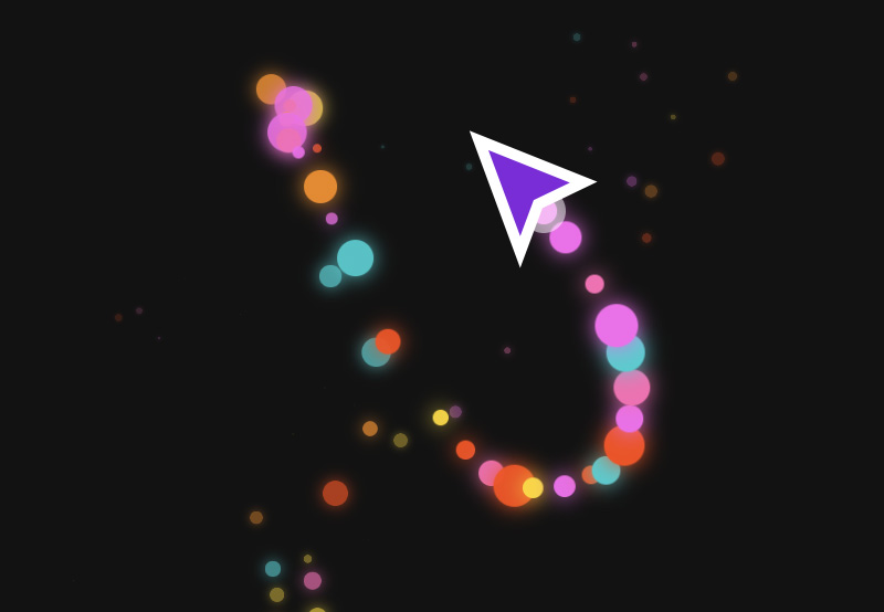
By the end of this tutorial, you’ll have created something like this:
HTML structure
Our HTML structure will be very minimal, featuring nothing more than a cursor and a paragraph. Here is all the HTML we need:
1 |
|
2 |
|
Styling the cursor and sparkle trail
In the demo, you’ll notice we have a custom cursor with trailing sparkles that follow the mouse movement. To achieve this, we will hide the default cursor and then create our own custom cursor with a sparkling trail.
Here are the styles needed for the sparkle cursor tool.
1 |
body { |
2 |
margin: 0; |
3 |
height: 100vh; |
4 |
background-color: #121212; |
5 |
cursor: none; |
6 |
overflow: hidden; |
7 |
display: flex; |
8 |
justify-content: center; |
9 |
align-items: center; |
10 |
}
|
11 |
|
12 |
.title { |
13 |
color: white; |
14 |
font-size: 1rem; |
15 |
text-align: center; |
16 |
}
|
17 |
|
18 |
.cursor { |
19 |
position: absolute; |
20 |
width: 20px; |
21 |
height: 20px; |
22 |
border-radius: 50%; |
23 |
background-color: rgba(255, 255, 255, 0.5); |
24 |
pointer-events: none; |
25 |
transform: translate(-50%, -50%); |
26 |
z-index: 9999; |
27 |
}
|
28 |
|
29 |
.cursor-trail { |
30 |
position: absolute; |
31 |
border-radius: 50%; |
32 |
pointer-events: none; |
33 |
transform: translate(-50%, -50%); |
34 |
}
|
Add JavaScript to see the magic
Let’s first get the cursor element from the HTML.
1 |
const cursor = document.querySelector(".cursor"); |
Next, let’s define a set of vibrant colors for the sparkles. You can customize the colors as you like. Here is the array containing the colors I am working with.
1 |
const colors = [ |
2 |
"#FFD700", |
3 |
"#FF8C00", |
4 |
"#FF4500", |
5 |
"#FB68EE", |
6 |
"#FF69B4", |
7 |
"#00CED1", |
8 |
];
|
The next step is to track mouse movements on the page and update the position of our custom cursor based on the mouse’s clientX and clientY positions.
1 |
document.addEventListener("mousemove", (e) => { |
2 |
cursor.style.left = e.clientX + "px"; |
3 |
cursor.style.top = e.clientY + "px"; |
4 |
|
5 |
});
|
Both clientX and clientY are properties of a mouse in JavaScript. clientX will give you the horizontal position of the mouse pointer relative to the viewport, while clientY will give you the vertical position of the mouse pointer relative to the viewport.
In other words, when you move your mouse on a webpage, clientX and clientY will precisely tell you the position of the mouse. These values are measured from the top left corner of the current visible window.
Simple demonstration using code
Just to really give you an idea of what we’re doing, copy the following code:
1 |
window.addEventListener('mousemove', (e) => { |
2 |
console.log(`X: ${e.clientX}, Y: ${e.clientY}`); |
3 |
});
|
If you paste this code in your browser’s console tab and move your mouse around the screen, you will see the positions updating in real-time.


Create a Sparkle
A sparkle is simply a small round element that appears along the mouse trail adding a magical effect. To generate these sparkles, we will create an element for each sparkle, apply styles and animations, and dynamically place them at random positions from the mouse position.
Create a function called createSparkle() that will handle the generation of each sparkle element.
1 |
function createSparkle(x, y) { |
2 |
const sparkle = document.createElement("div"); |
3 |
sparkle.classList.add("cursor-trail"); |
4 |
|
5 |
}
|
This div will act as a sparkle. To ensure each sparkle is unique in terms of size, color, and distance, we’ll use Math.random() to assign random values to a few properties.
1 |
const color = colors[Math.floor(Math.random() * colors.length)]; |
2 |
const size = Math.random() * 15 + 5; |
3 |
const angle = Math.random() * Math.PI * 2; |
4 |
const distance = Math.random() * 50 + 10; |
Here is a breakdown of each property:
color: a random color picked from the colors arraysize: a random size between 5px and 20px to keep the sparkles small in sizedistance: This is the distance of the sparkle from the cursor positionangle: The direction in which the sparkle will move
Apply the defined properties as styles.
1 |
sparkle.style.backgroundColor = color; |
2 |
sparkle.style.boxShadow = `0 0 10px ${color}`; |
3 |
sparkle.style.width = `${size}px`; |
4 |
sparkle.style.height = `${size}px`; |
We also need to position the sparkle at the current mouse location to ensure each sparkle starts at the mouse’s position before moving outward.
1 |
sparkle.style.left = `${x}px`; |
2 |
sparkle.style.top = `${y}px`; |
Finally, add the sparkle to the page.
1 |
document.body.appendChild(sparkle); |
Animating the Sparkle
In CSS, animations are often created using keyframes. Keyframes allow us to define how an element’s properties change over time. For instance, to achieve the effect needed for our sparkles, we will animate two properties, mainly opacity (for fading out) and tranform (to make the sparkle move away from the cursor position).
We will apply these keyframes using the JavaScript web Animations API and the animation will look like this:
1 |
sparkle.animate( |
2 |
[
|
3 |
{
|
4 |
opacity: 1, |
5 |
transform: "translate(-50%,-50%) scale(1)", |
6 |
},
|
7 |
{
|
8 |
opacity: 0, |
9 |
transform: `translate(calc(-50% + ${ |
10 |
Math.cos(angle) * distance |
11 |
}px), calc(-50% + ${Math.sin(angle) * distance}px)) scale(0)`, |
12 |
},
|
13 |
],
|
14 |
|
15 |
);
|
Let’s break down the animation logic
Keyframes define different states of an animation. In our case, we have two states:
-
Initial state: The sparkles starts at
opacity: 1(fully visible),translate (-50% ,-50%)centers the sparkle exactly on the cursor position, andscale(1)means the sparkle is its original size. -
Final state: The sparkle fades out with
opacity:0. Thetranslate(calc (...))moves the sparkle from the center by a calculated distance andscale (0)shrinks it completely.
Let’s add a duration and an easing function for a smooth animation.
1 |
function createSparkle(x, y) { |
2 |
const sparkle = document.createElement("div"); |
3 |
sparkle.classList.add("cursor-trail"); |
4 |
|
5 |
const color = colors[Math.floor(Math.random() * colors.length)]; |
6 |
const size = Math.random() * 15 + 5; |
7 |
const angle = Math.random() * Math.PI * 2; |
8 |
const distance = Math.random() * 50 + 10; |
9 |
|
10 |
sparkle.style.backgroundColor = color; |
11 |
sparkle.style.boxShadow = `0 0 10px ${color}`; |
12 |
sparkle.style.width = `${size}px`; |
13 |
sparkle.style.height = `${size}px`; |
14 |
sparkle.style.left = `${x}px`; |
15 |
sparkle.style.top = `${y}px`; |
16 |
|
17 |
document.body.appendChild(sparkle); |
18 |
|
19 |
|
20 |
sparkle.animate( |
21 |
[
|
22 |
{
|
23 |
opacity: 1, |
24 |
transform: "translate(-50%,-50%) scale(1)", |
25 |
},
|
26 |
{
|
27 |
opacity: 0, |
28 |
transform: `translate(calc(-50% + ${ |
29 |
Math.cos(angle) * distance |
30 |
}px), calc(-50% + ${Math.sin(angle) * distance}px)) scale(0)`, |
31 |
},
|
32 |
],
|
33 |
{
|
34 |
duration: 1000, |
35 |
easing: "cubic-bezier(0.4, 0, 0.2, 1)", |
36 |
fill: "forwards", |
37 |
}
|
38 |
);
|
39 |
setTimeout(() => { |
40 |
sparkle.remove(); |
41 |
}, 1000); |
42 |
}
|
Here is what each property does:
-
duration:100: runs the animation for one second -
easing: "cubic-bezier(0.4, 0, 0.2, 1)": Ensures smooth movement -
fill: "forwards": ensures the sparkles fades out after the animation ends.
Remove the sparkle element from the DOM after the animation is done.
1 |
setTimeout(() => { |
2 |
sparkle.remove(); |
3 |
}, 1000); |
The final code for the createSparkle() function will look like this:
1 |
function createSparkle(x, y) { |
2 |
const sparkle = document.createElement("div"); |
3 |
sparkle.classList.add("cursor-trail"); |
4 |
|
5 |
const color = colors[Math.floor(Math.random() * colors.length)]; |
6 |
const size = Math.random() * 15 + 5; |
7 |
const angle = Math.random() * Math.PI * 2; |
8 |
const distance = Math.random() * 50 + 10; |
9 |
|
10 |
sparkle.style.backgroundColor = color; |
11 |
sparkle.style.boxShadow = `0 0 10px ${color}`; |
12 |
sparkle.style.width = `${size}px`; |
13 |
sparkle.style.height = `${size}px`; |
14 |
sparkle.style.left = `${x}px`; |
15 |
sparkle.style.top = `${y}px`; |
16 |
|
17 |
document.body.appendChild(sparkle); |
18 |
|
19 |
sparkle.animate( |
20 |
[
|
21 |
{
|
22 |
opacity: 1, |
23 |
transform: "translate(-50%,-50%) scale(1)", |
24 |
},
|
25 |
{
|
26 |
opacity: 0, |
27 |
transform: `translate(calc(-50% + ${ |
28 |
Math.cos(angle) * distance |
29 |
}px), calc(-50% + ${Math.sin(angle) * distance}px)) scale(0)`, |
30 |
},
|
31 |
],
|
32 |
{
|
33 |
duration: 1000, |
34 |
easing: "cubic-bezier(0.4, 0, 0.2, 1)", |
35 |
fill: "forwards", |
36 |
}
|
37 |
);
|
38 |
setTimeout(() => { |
39 |
sparkle.remove(); |
40 |
}, 1000); |
41 |
}
|
Finally, let’s enable touch events for mobile devices. This will ensure the sparkle effect on mobile devices work by tracking the finger movement.
1 |
document.addEventListener( |
2 |
"touchmove", |
3 |
(e) => { |
4 |
e.preventDefault(); |
5 |
const touch = e.touches[0]; |
6 |
cursor.style.left = touch.clientX + "px"; |
7 |
cursor.style.top = touch.clientY + "px"; |
8 |
createSparkle(touch.clientX, touch.clientY); |
9 |
},
|
10 |
{ passive: false } |
11 |
);
|
End result
Here is the final demo!
Conclusion
That’s it for our sparkle cursor. The best part about custom cursors is that the possibilities are endless. You can experiment with different shapes, animations, images, or even content to create unique and memorable custom cursors. Enjoy!