How to Design and Use Them
WP web icons help you create fast, consistent, and accessible WordPress sites that reflect your brand identity. This guide explains how to design, optimize, and implement SVG-based icons that look sharp on any screen, load quickly, and maintain visual consistency across projects. Learn how to host, style, and manage web icons efficiently for better performance and a more unified digital presence.
When visitors land on your website, small visual cues carry a significant impact. Buttons, navigation menus, and tab icons help users instantly recognize your brand. These elements define how professional, consistent, and memorable your online experience feels.
WordPress web icons solve this challenge. Unlike traditional icon fonts or static favicons, web icons are vector-based design elements that merge performance with branding. They’re lightweight, accessible, and scalable. They support everything from simple WordPress sites to enterprise-grade dashboards.
This guide covers what WP web icons are, how to create and implement them, and why they matter. Properly implemented web icons deliver fast, cohesive WordPress experiences aligned with your hosting and performance goals.
What Are WP Web Icons and Why Do They Matter
Before designing or implementing web icons, it helps to understand their purpose in the WordPress ecosystem. Icons might seem like tiny details, but they anchor the look and feel of every user interaction. Whether you’re building for speed, clarity, or recognition, web icons turn everyday elements into branded, meaningful design.
The Role of Web Icons in Modern WordPress Design
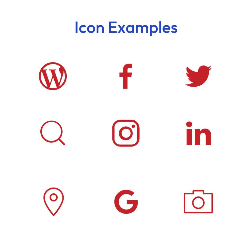
Web icons are the visual glue of your WordPress ecosystem. They appear everywhere, in navigation menus, feature blocks, dashboards, CTAs, and even in browser tabs. Each icon carries meaning, signaling interactions, functions, or branding.
In practice, web icons do more than decorate your interface. They enhance usability by giving users visual signposts that improve navigation and recall. Consistent iconography reinforces professionalism and user confidence. This applies whether you’re building a hosting dashboard with performance metrics or a blog with visual category cues.
A clear, branded icon set makes your WordPress site look unified across every device. It demonstrates attention to detail and reflects the same reliability you expect from your hosting infrastructure.
Web Icons vs. Icon Fonts vs. Favicons
Understanding how web icons differ from older icon systems helps you make better design decisions. Choosing the right approach ensures your site loads faster and looks sharper across devices.
| Format | Best Use Case | Pros | Cons |
|---|---|---|---|
| Icon Fonts | Legacy sites that use many icons | Large libraries, scalable | Can be heavy; accessibility issues; hard to customize colors per icon |
| Favicons | Browser tab branding | Brand recognition in browsers | Limited use; not scalable in design systems |
| Web Icons (SVG) | Modern, performance-focused sites | Crisp scaling, accessible, lightweight, brand-flexible | Requires setup for local hosting or enqueueing |
SVG-based web icons offer minimal file size and pixel-perfect rendering on retina screens. They scale infinitely without distortion and can be styled with CSS. This makes them ideal for responsive WordPress themes.
Designing Effective WP Web Icons
Designing icons is both a creative and strategic process. Align your web icons with your brand’s visual system. Every line and color should communicate professionalism.
Icons visually express movement and growth, echoing the brand’s emphasis on forward motion and people-first hosting.
Color and Contrast Best Practices
Once your icon shapes are set, the next consideration is visibility. Color and contrast determine how easily users can interpret your icons in different environments. Getting this right ensures your design works equally well on mobile, desktop, and dark mode interfaces.
Your web icons should work across all environments, light mode, dark mode, and high-contrast settings. Use red, blue, or white icons for dark backgrounds and charcoal or black icons for light ones.
Contrast isn’t just a visual choice; it’s an accessibility requirement. High-contrast icons improve readability, especially for users with visual impairments or when viewed on low-brightness mobile devices.
A simple way to test contrast is to preview your icons in grayscale. If an icon remains visible and distinct, it will perform well across all display conditions.
Accessibility and Scalability
After establishing design rules, focus on accessibility. Web icons must serve every visitor equally, including those using assistive technology. Ensuring proper markup and scalability makes your site more inclusive while improving SEO and performance.
Every visual decision affects usability. To ensure your icons are accessible:
- Add aria-hidden=”true” to purely decorative icons so screen readers skip them.
- Include text equivalents or hidden labels for functional icons, such as navigation or actions.
- Use SVGs instead of raster images for sharper scaling and lower bandwidth.
SVGs are resolution-independent, meaning they’ll always look crisp. Whether viewed on a 4K monitor or a mobile phone. And because SVGs are text-based, browsers can parse and cache them efficiently, improving load performance.
Implementing WP Web Icons in WordPress
Designing is only half the equation; now comes the technical side. Implementing web icons properly ensures they load quickly and behave consistently across your entire WordPress environment. This section walks through the cleanest, most performance-focused way to do it.
Adding WP Web Icons to Your WordPress Theme
You can implement WP web icons directly into your WordPress theme without heavy plugins. Here’s a clean, performance-friendly method:
- Upload your optimized SVG icons into a /assets/icons/ folder within your theme directory.
- Create a stylesheet (style.css or icons.css) to define icon classes and styling.
- Enqueue that stylesheet in your functions.php file:
function imh_enqueue_icons() { wp_enqueue_style( 'imh-icons', get_template_directory_uri() . '/assets/icons/style.css' ); } add_action( 'wp_enqueue_scripts', 'imh_enqueue_icons' );- Add your SVG icon inline or by reference in your HTML
- Adjust size and color via CSS to ensure consistency with your design palette.
How to Create and Upload WP Web Icons
Now that you know how web icons work, let’s cover the creation process from start to finish. You don’t need complex tools; you just need attention to size, clarity, and branding. Follow these steps to build icons that look professional and load instantly:
- Design your icons in Figma, Illustrator, or Canva using simple, clear shapes. Stick to one stroke weight and avoid excess detail.
- Export as SVG files and check each for clean code. Remove unnecessary metadata or fills to keep files lightweight.
- Name each file consistently (for example, imh-icon-speed.svg) and store them in your WordPress theme’s /assets/icons/ folder.
- Upload the icons through your WordPress dashboard using the Media Library or FTP/SFTP.
- Preview your site to confirm proper scaling, alignment, and color contrast across desktop and mobile devices.
Once uploaded, web icons are easy to reuse. They can be applied to new pages, sections, or campaigns without losing visual or technical consistency.
Hosting and Performance Optimization
Even the best icon system fails if it slows your site down. Hosting and performance strategy determine whether your web icons help or hurt your user experience. Fortunately, WordPress makes optimization straightforward when you start with the right approach.
- Host icons locally on your WordPress server rather than using external libraries. Local files benefit from your host’s NVMe storage and avoid third-party DNS lookups.
- Minimize requests by combining multiple icons into an SVG sprite or serving only what’s used per page.
- Use caching headers so browsers store icons long-term.
- Compressed assets using tools like Gzip or Brotli compression can reduce SVG file sizes by 60% or more.
- Leverage CDN distribution to serve icons globally with minimal latency.
Fast icons aren’t just cosmetic; they contribute to measurable performance gains in Lighthouse and Core Web Vitals.
Fallbacks and Testing
Before finalizing your implementation, prepare for real-world conditions. Icons might fail to load due to network interruptions or outdated browsers, so having fallbacks protects usability. Testing ensures your icons perform consistently in every context.
Icons should fail gracefully if they can’t load. When designing, include text labels or alternative symbols for critical functions (e.g., navigation arrows, save buttons).
Test your icons:
- Across multiple browsers (Chrome, Firefox, Safari, Edge)
- On desktop and mobile screens
- In dark and light themes
- Under slow network conditions
Proper testing ensures consistent performance and prevents layout shifts that can affect user experience and search ranking.
Maintaining Brand Consistency Across Projects
After setup, maintaining consistency becomes an ongoing discipline. As your business grows, you’ll likely manage multiple WordPress projects, and each must reflect the same level of polish and identity. A unified web icon strategy ensures that no matter where users interact with your brand, the experience feels cohesive.
Building a Centralized Icon System
For WordPress developers and agencies managing multiple projects, consistency becomes a challenge. A centralized icon system simplifies updates and maintains a professional visual identity.
Here’s how to organize your system effectively:
- File structure: Group icons by function (/navigation/, /social/, /cta/, etc.).
- Naming conventions: Use predictable patterns like imh-icon-speed.svg or imh-icon-support.svg.
- Storage: Keep your master icon library in a shared location, such as Google Drive, Figma, or a GitHub repository.
- Version control: Document changes in your style guide so updates propagate smoothly across projects.
When each team member uses the same source assets, you eliminate inconsistencies, reinforcing your brand at every digital touchpoint.
Customizing Icons for Products or Sub-Brands
Consistency doesn’t mean uniformity. Once your foundation is set, small design adjustments can help visually differentiate product lines or service tiers without breaking your brand system. Done right, these adjustments enhance clarity and marketing alignment.
For example:
- Use blue line accents for WordPress-related products (WP3).
- Use orange for VPS or cloud infrastructure products.
- Keep red as your primary brand identifier for general-purpose hosting.
Each icon remains visually consistent (same stroke weight, same line curvature) but gains product-specific context. That’s how you scale identity without fragmenting your brand.
This approach allows your brand to scale seamlessly, maintaining design integrity and consistency as it grows.
Common Mistakes to Avoid
Even with a well-built system, it’s easy to overlook small details that weaken performance or design consistency. Learning from these pitfalls keeps your icons and your brand looking sharp across every site and update.
Common Implementation Mistakes
Avoid these common mistakes when implementing WP web icons:
- Overloading libraries: Don’t import entire Font Awesome or Material sets when you only need a few icons. Load selectively.
- Ignoring accessibility: Skipping ARIA tags or alt text leaves users behind.
- Breaking the palette: Stay within your approved color system. Off-brand colors create visual noise.
- Poor scaling: Always export SVGs properly; rasterized icons blur on retina displays.
Each mistake is preventable with attention to design discipline and technical setup. Use your icon system as part of a larger performance strategy, not an afterthought.

Advanced Applications of WP Web Icons
As your design maturity grows, WP web icons can extend beyond basic site decoration. Advanced teams can integrate them into automated workflows, shared systems, and scalable branding pipelines. These approaches help your creative and development teams move faster while staying on-brand.
Streamlining Multi-Site or Agency Workflows
For agencies or development teams managing multiple client sites, WP web icons can become reusable assets. Build your icon set once, then integrate it across multiple WordPress installs.
Use tools like:
- WordPress Multisite: Share a single icon directory across child sites.
- CI/CD pipelines: Push updates from your design library directly to production.
- CDNs: Host shared assets for global performance consistency.
This reduces design debt and keeps your teams focused on creative growth rather than maintenance.
Integrating Web Icons Into a Full Design System
Finally, take your icons from static files to dynamic components within your design ecosystem. Integration with tools like Figma or Canva ensures brand alignment from concept to deployment. This level of cohesion turns icon design into a competitive advantage.
WP web icons work best as part of a broader brand ecosystem. Integrate them with:
- Figma libraries for design mockups.
- Canva templates for marketing assets.
- WordPress block patterns for reusable site components.
This ecosystem ensures that from your homepage to your knowledge base, every icon, button, and interface detail feels unmistakably “you.”
That alignment between creativity and performance builds trust, ensuring every experience feels consistent both visually and technically.
Conclusion
Each web icon you design, place, and optimize tells your visitors something about your brand. It shows that you value detail, accessibility, and speed. These are the same traits that define exceptional hosting and digital experiences. Web icons make your WordPress site faster, cleaner, and easier to recognize.
When implemented thoughtfully (with proper color, structure, and hosting performance), they strengthen your brand while contributing to measurable technical improvements.
As your WordPress projects grow, let your icons grow with them. Scalable, consistent, and lightning fast, just like the hosting that powers them.


