Symmetrical and Asymmetrical Balance Design Principals
Learn how symmetrical and asymmetrical balance transform your website’s user experience. Symmetrical designs use mirror-image elements along a central axis to create formality and stability for your visitors. Asymmetrical approaches harness different visual weights through scale, color, and texture to deliver dynamic, engaging layouts. Discover which balance technique best serves your brand’s purpose and how…
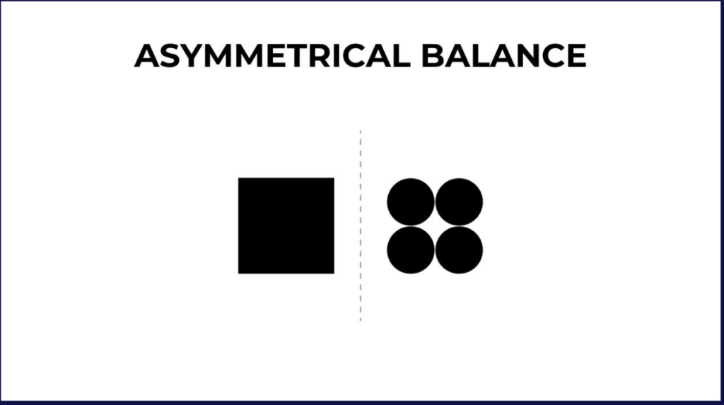
Asymmetrical balance is a design that manages to achieve a sense of balance despite not being symmetrical.
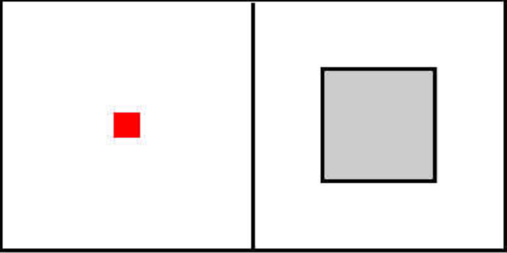
It is the opposite of symmetrical balance, which is when all visual objects in the design are equally distanced from the central axis.
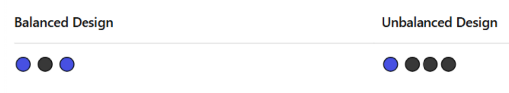
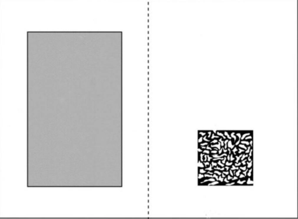
In the balanced example, the elements are evenly spaced and weighted on both sides. Meanwhile, the right side (unbalanced design) is visually heavier, which creates a sense of instability.
Balance, whether symmetrical or asymmetrical, is a fundamental design principle that plays a crucial role in shaping user experience and perception.
In this article, we will dive into the principles of symmetrical and asymmetrical balance as well as how both are used in design. This is important in the visual design of your website, as the balance will send signals to your readers about the quality and focus of your website.
What is Asymmetrical Balance?
Asymmetrical balance is a design term for when two dissimilar sides of a design with unequal visual weight are used to create an optical arrangement that still manages to please the human eye despite lacking symmetry.
Types of Asymmetrical Balance
1. Scale
In asymmetrical design, playing with scale means using elements of different sizes to guide the viewer’s eye and create visual interest. For example, a large photo on one side can be balanced by several smaller design elements, like text blocks or icons, on the opposite side. Even though the sides are unequal, the composition still feels cohesive and intentional.
2. Color
Color can also establish balance without symmetry. A bold, saturated color in one corner can be balanced by a larger area of muted tones on the other side. The trick is understanding that brighter or warmer colors naturally carry more visual weight, so they don’t need to take up as much space to have impact.
3. Texture
Texture adds a tactile quality to design, even in digital formats. A rough or detailed texture in a small area can draw as much attention as a larger, smoother surface. When used thoughtfully, texture helps offset other design elements and adds depth without requiring symmetry.
With asymmetrical balance, the goal is for all the elements of a design to create a similar sense of weight on each side of the composition.
This is done by using other elements like negative space, object placement, and line placement to create a sense of balance.
Asymmetrical Balance in Design
Asymmetrical balance lacks symmetry, which is a natural way to find balance in a design. For that reason, it is considered a more sophisticated design technique and one that takes practice and patience to master.
To achieve asymmetrical balance in a design, it’s all about the placement of the elements and the visual weight.
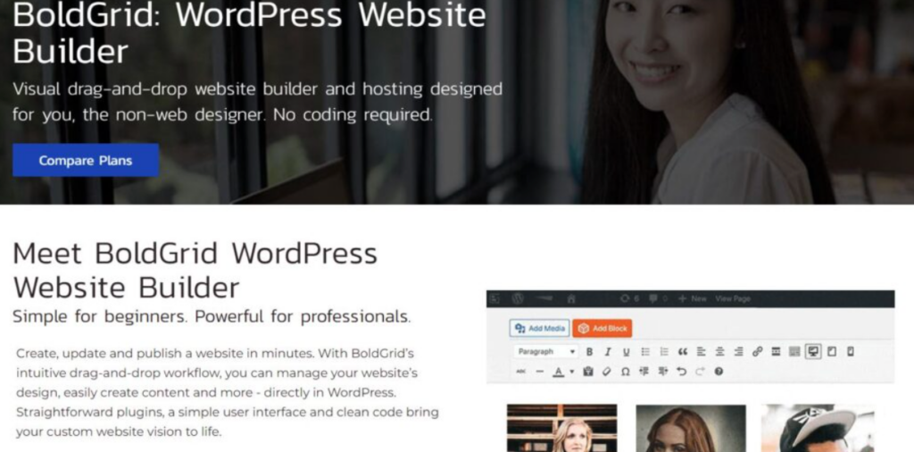
Take a look at the above screenshot from our BoldGrid Website Builder page. Notice how the design lacks symmetry, but still utilizes negative space and offset sections to create a balanced feel.
When to Use Asymmetrical Balance
Here are a few perfect scenarios to use asymmetrical balance:
- Modern websites: If you’re designing for a sleek, contemporary brand or tech product, asymmetrical balance helps break away from the overly structured feel of traditional layouts. It keeps things fresh and visually interesting, especially on landing pages or brand storytelling sites.
- Dynamic content platforms: Have a site filled with motion graphics, interactive elements, or lots of varied content blocks? Asymmetry gives you the freedom to guide the user’s eye across the screen in a way that feels natural but not forced.
- Creative portfolios: For designers, photographers, or artists, asymmetry offers a chance to showcase originality. It mirrors the creative process – unpredictable, bold, and free-form – while still maintaining visual harmony.
Psychological Effects of Asymmetrical Balance
Asymmetry might seem chaotic at first glance. However, when done right, it can feel more human.
- It draws attention to key elements because the eye naturally wants to explore what’s different or unexpected.
- It creates movement, which keeps users more engaged as they scroll or interact.
- It gives off a sense of creativity and openness, making brands feel more approachable and forward-thinking.
- Most importantly, it feels organic, like a real conversation rather than a scripted one.
When it comes to finding balance in design, symmetry might provide a more natural and stable feel, but asymmetrical balance conveys a more playful, dynamic feel to its audience.
Asymmetrical balance is bold. It evokes a sense of modernism and movement.
This type of balance can be a great way to grab someone’s attention or stand out from the crowd.
Common Asymmetrical Balance Mistakes
Since web design elements (like balance) impact how users feel/respond to your site, it’s important to know what messages you’re conveying. Designers often confuse asymmetrical balance with randomness. While asymmetry allows for creative freedom, it still requires planning to achieve visual harmony. Here are common pitfalls and how to correct them:
1. Overloading one side of the design
- Mistake: Placing a heavy visual element (like a large image or bold color block) on one side without any visual counterbalance.
- Result: The design feels lopsided or incomplete, drawing attention to one corner and ignoring the rest.
- Fix: Introduce multiple smaller elements on the opposite side (light text, icons, or white space). It ensures even visual weight distribution.
2. Ignoring hierarchy and focal points
- Mistake: Adding elements of various sizes and shapes without a clear point of focus or visual path.
- Result: The viewer’s eye wanders, leading to confusion and a lack of engagement.
- Fix: Establish a visual hierarchy by making one element dominant and others supportive. Use positioning, contrast, and spacing to guide the eye naturally through the layout.
3. Clashing colors without purpose
- Mistake: Using highly saturated or contrasting colors on opposite sides just to fill space.
- Result: Instead of balance, the design feels chaotic or overwhelming.
- Fix: Use color strategically to either highlight or soften certain areas. One bold color can be balanced by surrounding it with neutral tones or negative space on the other side.
4. Too much negative space on one side
- Mistake: Leaving an entire half of the design blank while cramming content into the other half.
- Result: The imbalance feels unintentional, and the design lacks cohesion.
- Fix: Use negative space mindfully. Balance it with subtle visual anchors like soft textures, shadows, or small icons that don’t overpower the design but still add interest.
5. Misalignment of visual anchors
- Mistake: Placing key elements (like logos, headers, or call-to-actions) without considering their alignment or relationship to surrounding content.
- Result: The layout feels scattered and lacks professional polish.
- Fix: Use invisible grids or alignment lines to ensure that elements speak to each other. Even in asymmetrical layouts, consistency in spacing and alignment creates cohesion.
Tools for Measuring Asymmetrical Balance
Several tools can help you evaluate whether your visual composition feels balanced, even without perfect symmetry. These include:
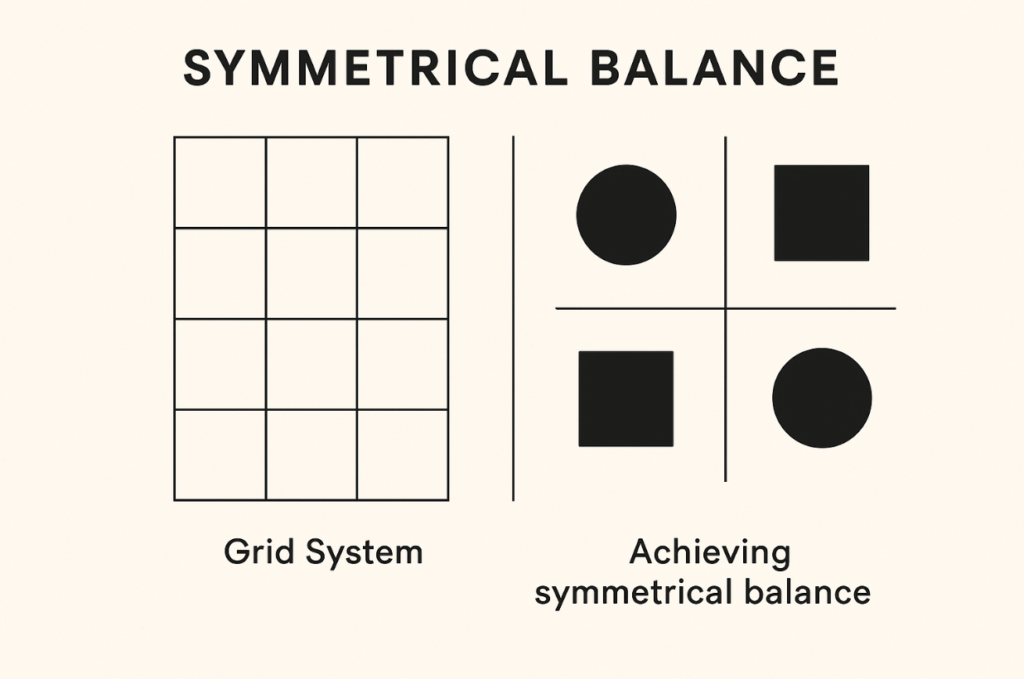
- Grid systems: Grids help organize content and maintain a sense of structure. They let you see if elements are spaced and aligned in a visually balanced way.
- Visual Weight Calculators: Several design software programs offer features to estimate visual weight. Examples: Adobe Illustrator, Adobe InDesign, Figma, Sketch, etc.
- Feedback from Peers: Share your design with someone else and ask where their eyes go first. If everyone is drawn to one side, that might be a sign to adjust the composition.
Balance in Responsive Design
Balance in responsive design isn’t just about symmetry. Instead, it’s also about visual harmony across all screen sizes. What looks perfectly balanced on a desktop might feel crowded or disjointed on a mobile device.
To keep things balanced, designers often rely on techniques like adjusting padding, scaling fonts, reordering content, or using breakpoints to control layout shifts. For mobile, less really is more – clean layouts, centered alignment, and smart use of white space go a long way in keeping things visually pleasing and easy to navigate.
What is Symmetrical Balance?
Symmetrical balance is when all visual elements of a design are equally distanced from the central axis, making both sides of a composition identical mirror images of each other.
It is a more traditional and natural way to find balance in art and design.
Types of Symmetrical Balance
Symmetrical balance brings harmony by evenly distributing visual weight. It comes in several forms, each creating a unique sense of order:
- Reflection symmetry: This is the classic mirror symmetry. One side of the design is a direct reflection of the other, often seen in architecture and logo design.
- Rotational symmetry: Here, elements rotate around a central point, like the spokes of a wheel or a floral pattern. It adds rhythm and movement while maintaining balance.
- Translational symmetry: This occurs when an element is repeated across space. You may think of it like a tiled floor or a row of identical icons. It provides consistency and flow, guiding the viewer’s eye smoothly across the design.
A good example of symmetrical balance in nature is the human face. If you were to draw a line down the middle of your face, you would have two sides that have the same design.
Symmetrical Balance in Design
Symmetry is used so regularly to find balance in design that the two terms are often confused.
However, balance is the distribution of the visual weight of objects, colors, textures, and space. Symmetry is just a way to achieve this.
Because symmetrical balance is more natural, it can be used to give your design a more classical, structured feel or evoke a sense of formality.
Interactive Balance
Interactive elements like hover states, scrolling effects, and animations can shift visual balance by drawing attention or altering layout dynamics. For example, a hover animation that enlarges one button more than others can create an imbalance. Smooth scroll-triggered transitions, however, can guide the eye evenly, helping maintain balance across varying screen sizes and content flow.
When Symmetrical Balance Works Best
Symmetrical balance shines in settings where elegance, order, and formality are key. It creates a sense of harmony and stability that makes users feel comfortable and confident in what they’re viewing. Here’s where it works best:
- Formal websites: Government, legal, and institutional websites benefit from symmetrical layouts because they convey professionalism, structure, and trust. When everything is aligned and predictable, users can navigate without confusion.
- Wedding sites: Whether it’s a couple’s wedding site or a professional wedding planning service, symmetrical design evokes romance and tradition. It mimics the balance and partnership at the heart of marriage itself.
- Luxury brands: From high-end fashion to fine jewelry, symmetrical design adds to the feeling of refinement. Balanced visuals help frame luxury products in a way that feels upscale, polished, and timeless.
Psychological Impacts of Symmetrical Balance
Symmetrical balance is like comfort food for the brain – it just feels right. When everything is evenly aligned, our minds recognize the order instantly. That’s why symmetrical layouts tend to feel calm, polished, and trustworthy.
Here’s how it impacts our minds:
- Because both sides mirror each other, symmetrical designs feel grounded. There’s no visual tension, and nothing feels out of place. This is especially useful for industries where trust and professionalism are key, like finance, healthcare, or law.
- We’re used to symmetry in nature and architecture—think of human faces, butterflies, or classical buildings. That sense of familiarity helps users feel at ease when browsing a site or reading content.
- A symmetrical layout can communicate that you’re reliable, consistent, and detail-oriented. It subtly reassures users that they’re in good hands without you needing to say a word.
Choosing the Right Balance for Your Design
Not sure whether to go for symmetrical or asymmetrical balance in your design? The right choice depends on more than just aesthetics.
Here’s how to make that decision smarter:
Practical Criteria for Selecting Balance Type
- Brand personality
- Symmetrical balance works well for traditional, elegant, and luxury brands that want to evoke stability and trust.
- Asymmetrical balance suits bold, creative, or edgy brands looking to express dynamism and modernity.
- Target audience
- Younger, tech-savvy audiences often respond better to asymmetry and unconventional layouts.
- Older or more conservative audiences may prefer clean, symmetrical designs that feel familiar and easy to navigate.
- Communication goals
- If your message is formal, structured, or authoritative, symmetrical balance reinforces that tone.
- For storytelling, innovation, or emotional impact, asymmetry creates visual interest and hierarchy.
- Device considerations (responsiveness)
- Symmetry adapts smoothly across devices, especially for grid-based mobile layouts.
- Asymmetry requires more testing to ensure that visual weight feels balanced on all screen sizes.
Quick Decision Checklist
Ask yourself the following questions to choose the right balance type:
| Question | Suggested Balance |
|---|---|
| Does your brand need to feel elegant, formal, or stable? | Symmetrical |
| Are you targeting a younger or design-forward audience? | Asymmetrical |
| Is your content structured and information-heavy? | Symmetrical |
| Do you want to guide the viewer’s eye in a specific flow or narrative? | Asymmetrical |
| Are you designing primarily for mobile-first layouts? | Symmetrical (or tested asymmetry) |
Asymmetrical balance is a great way to create a bold and more modern feeling design, but it’s not as easy to achieve as the traditional symmetrical balance.
On the other hand, symmetrical balance is found more naturally and can be an easy and effective way to produce designs that are more aligned with what people are used to. For those new to design, symmetrical balance is a great way to practice finding balance within your composition.
Both types of balance serve the same purpose, but can help you accomplish different things.
Depending on the message you want to send or the emotions you want to evoke from your audience, symmetrical and asymmetrical balance can be used to create your desired effect.
Mastering both forms of balance will only help you expand the tools you’ll have in your design toolbox.
Bringing Balance
Research consistently demonstrates that balanced web design enhances user engagement, information retention, and conversion rates. It is characterized by clean layouts, intuitive navigation, and strategic use of whitespace.
This is where platforms like inMotion Hosting come into play. Their website builder and WordPress solutions make it easy to create a good-looking, fully-functional website, no matter whether you’re running a portfolio, online store, or business blog.
Symmetrical and Asymmetrical Balance – FAQs
How do I know when to use symmetrical vs. asymmetrical balance for a website?
Use symmetrical balance for formal, stable designs and asymmetrical balance for dynamic, modern experiences that guide the eye.
How can I maintain balance when designing for both mobile and desktop?
Prioritize a flexible layout with scalable elements and a consistent visual hierarchy that adapts smoothly across breakpoints.
What elements carry the most visual weight in web design?
Images, bold typography, vibrant colors, and dense areas of content typically carry the most visual weight and draw user focus.
Hosting Optimized for WordPress
Upgrade your WordPress Hosting today with NVMe SSD storage, cPanel, free SSL, email included and save up to $566!
 Free Website Builder Free SSLs Unlimited Bandwidth
WordPress Hosting